
Timeline
April 2021-July 2021
My Role
Lead UX Designer and Researcher
Team
Ranier T(Lead UX Designer)
Benjamin W(Product Manager)
Mauro C(Engineer)
Fabio F(Engineer)
Overview
About April
April is a property-tech start-up that aims to act as a transparent and personalized apartment marketplace where renters can interact with short-form videos of apartments.
Currently, April is a real estate marketing service that provides marketing strategies to brokerages, but while I was at the company, the product acted as an apartment marketplace for renters to find their next apartment.
Design Brief
Our app was not reaching target KPIs
My teammate and I were tasked to redesign our mobile app because we found that our app was being underutilized and was not hitting our target KPIs. After looking at the app’s data, we found that there was a low retention rate and we saw that users typically did not return to use the app after their first initial download of the app.
Old Designs
Where is our design problematic?
Prior to user research, we analyzed our old designs to discover where our design was lacking. We discovered that the UI was inconsistent and inefficient, there was poor visual hierarchy and weak readability.


Main Pain Points
After conducting qualitative surveys and usability studies, I consolidated all my data into affinity diagrams to draw out recurring themes and observations. Through my analysis, we revealed the following pain points:
Incomplete Search Feature
Users were inclined to search for apartments by certain neighborhoods and specific apartment details. However, they felt there is a lack of customization for renters to tailor their apartment search.
Poor Listing Management
Users were unsure of where they could view their liked apartments and apartments they’ve inquired about. There is no centralized place to view and manage the apartments users have interacted with.
Insufficient Information
Users wanted more information and context about the apartments’ amenities and the surrounding local area. The majority of our users felt our product lacked sufficient details about the apartment or location.
HMW
How might we make renters feel more confident in their apartment search?
Design Requirements
Concise
The layout should be well-organized, with a clear hierarchy of elements, ensuring that users can easily scan and understand the content. The design needs to arrange and position elements such as text, images, buttons, and navigation in a concise and functional manner.
Personalized
Through our user interviews, we realized that many users wanted to be able to customize their apartment search further. The design should provide a targeted and meaningful experience by allowing the user to tailor their search to their needs.
Visually Appealing
The design should be visually appealing and intuitive for users to engage with. The use of visual cues and consistent design patterns should enhance usability, making it easier for users to navigate, find information, and accomplish tasks.
There is a lack of customization for users
Users faced limitations in the ways they were able to personalize their apartment search. Our design is missing essential queries, such as the number of bedrooms and bathrooms and a category like ‘city’ is too broad to fit our user’s needs. Our design also does not effectively provide feedback and confirmation for users when they select an action.

Competitive Analysis
We researched some competitors’ search filters to gain inspiration. As we looked through their search filters, we started to understand that the filters needed to serve as a simple but comprehensive way to display a variety of information. What we took away was:
Using text entry boxes in addition to slider bars for users to clearly enter information
Radio buttons for users to intuitively select and deselect items
Obvious ‘apply’ buttons for users to explicitly confirm their choices


How can we include key search criteria in our layout?
Sketches
After our competitive analysis, we started discussing what criteria we should include in our own filter system. Drawing back on our user research, we recalled that users wanted to be able to search for apartments through a few key elements, such as neighborhood, bedrooms, bathrooms, and amenities. We started sketching and iterating on different ways we could present those key elements. We played with the idea of cards, slider bars, search fields, and text field inputs as ways to organize our filters.
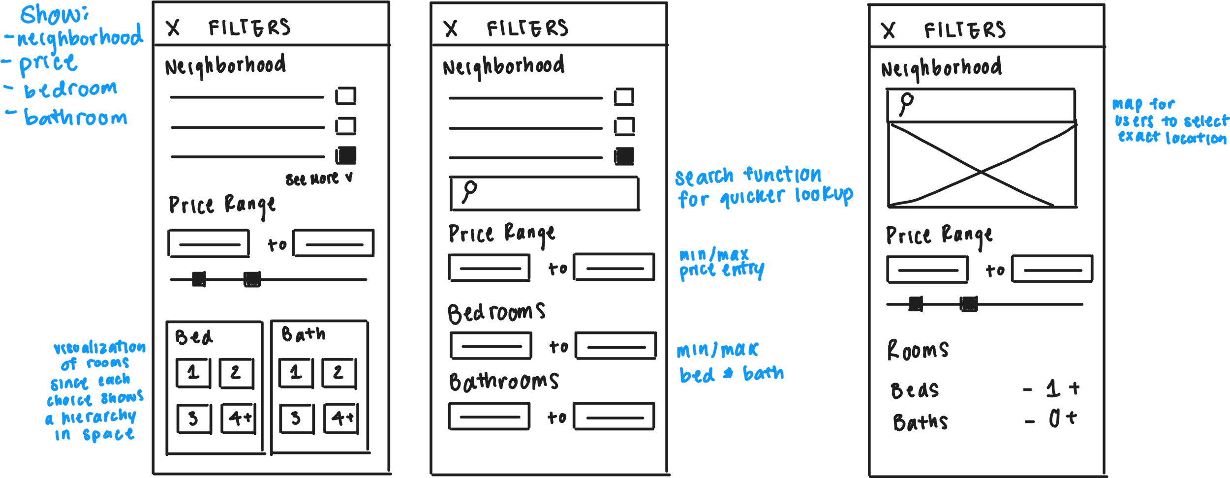
Wireframe
After feedback from our product manager, we landed on this wireframe as our new design. Our new design consists of a more expansive filter system with radio buttons for users to clearly select and deselect items, input text fields for specific price ranges, input steppers to intuitively add or remove the number of bedrooms and bathrooms and lastly a noticeable ‘apply’ button for users to clearly confirm their choices.
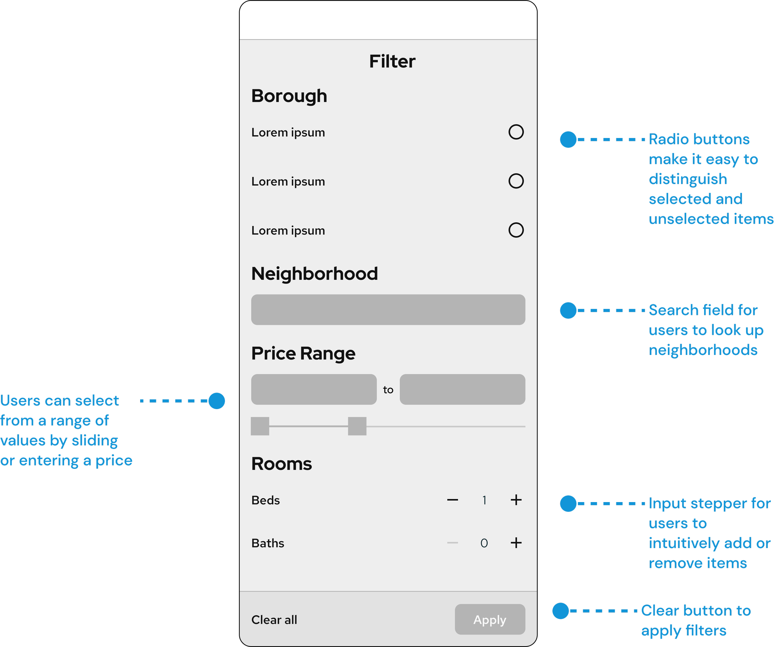
Final Filter Design
We provided functional elements for users to select options from a list of boroughs and neighborhoods and easily adjust their price range using our slider or by inputting the number themselves. Users now also have the option of selecting quantities of bedrooms and bathrooms by using the plus or minus icon. Lastly, we implemented a distinct apply button so users understand where they can implement their choices.


No centralized area to view or manage apartments
Through our user research, we learned that users thought it took too many steps to view apartments they’ve interacted with. Our old design isolated user’s favorited, liked, and disliked apartments from their offers and applications in 2 different tabs, the profile tab and the activity tab. We also discovered that the users’ offers and applications were displayed inefficiently. If users were to submit offers and apply to many apartments, the screen would quickly become cluttered and become too long to scroll through.
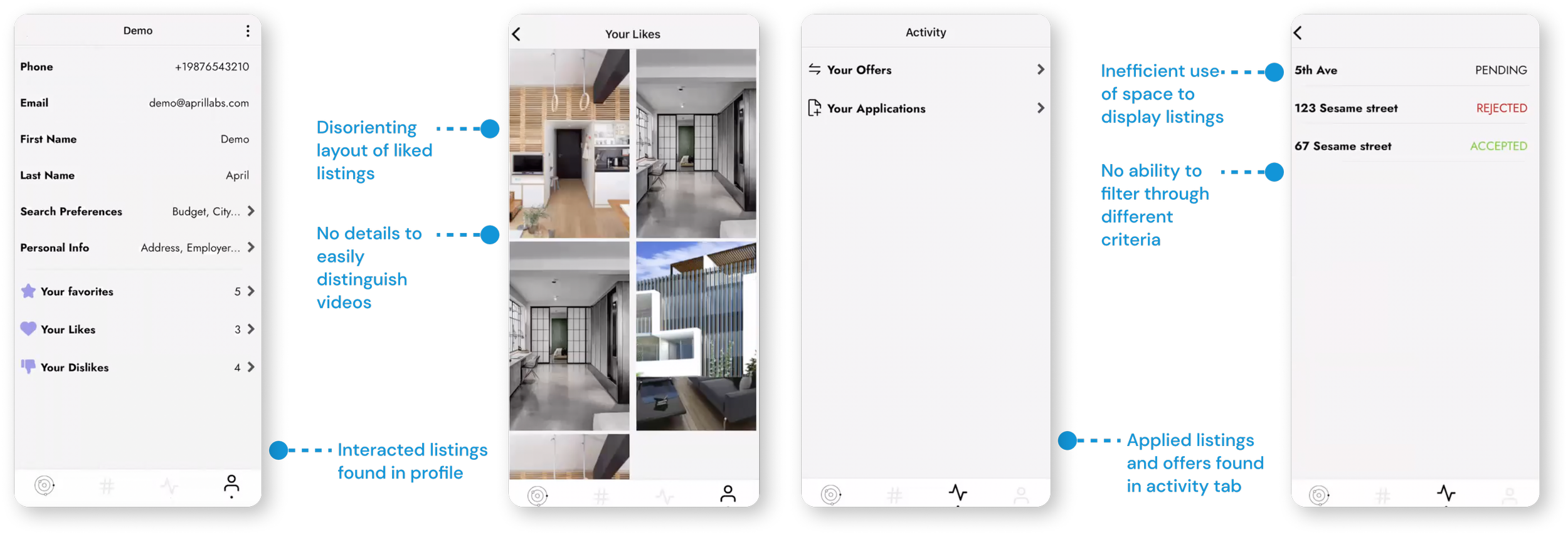
Profile Tab Wireframes
We started exploring how we could efficiently present the variety of content that a user would need to navigate. We took our users’ feedback into account and collapsed the old activity tab and the profile tab into one tab where they could view all their items. We played around with a couple of layouts, such as a list view, a modular card view, and a tab bar.

What could improve?
After discussing the different variations with our product manager, we felt that Version A and Version B could be more visually appealing, with the use of simple icons to represent each item and to indicate an item would move users to a new screen.
Although Version C and Version D simplified the user interface, it still encumbered users from their ultimate goal which was to efficiently and quickly access the items they wanted by hiding those items in secondary screens.
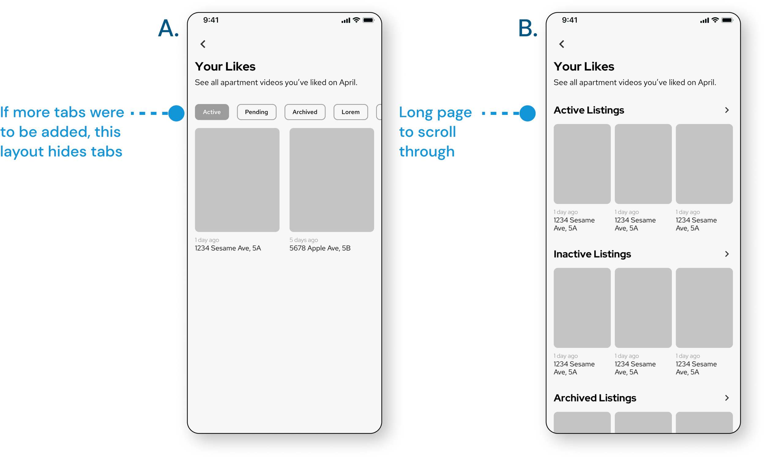
Child Pages Wireframes
For our child pages, we wanted our new designs to be easy to scan and easy to filter.
What could improve?
While Version A and C allowed the users to view their items in defined categories, we felt as if Version A’s tab bar and Version C’s UI layout would hide items and create readability issues in the future when more categories would be created to filter items. Both Version A and C created the issue of a long bar or page to scroll through as more categories got added.
Final Profile Tab Design
Taking all of our ideations, we created these frames as our final designs. My teammate Ranier took lead on the main profile screen and included a couple more item categories due to more business and product requirements.

What did we improve?
We created a visually appealing and functional profile tab where users can clearly navigate items through simple icons, effective buttons, and visually differentiating items.
In our old design, users could only view their listings by their address. We felt as if that put too much of a cognitive load on users to remember an apartment’s exact address. Now, users are able to quickly view their listings by using the video thumbnail as a visual cue, as well as the address and the time frame of their inquiry. Users can now also easily scan their inquiries or their liked videos by filtering the content from these 3 different criteria through the filter menu.
Insufficient information about the apartment
In our home tab, users are able to browse short-form videos of apartments and view the apartment’s details. In our old design, a reoccurring theme was our users desire for more information about the apartment’s details as well as local neighborhood information.

Poor Information Hierarchy
We discovered that the information hierarchy on the child details page was counterintuitive. We saw that information was incorrectly deprioritized, such as the price of the apartment, and call to actions like liking, disliking, and favoriting were prioritized over CTAs like making an offer or applying.
Weak Readability
We found that the readability of information on our home tab was difficult and inconsistent. The text and buttons on the screen would sometimes get washed out by the background of the video, making the information hard to read.
Home Tab User Flow
During this ideation phase, we closely collaborated with our product manager and marketing team to determine what our key business requirements and features are. We created a user flow for our home tab so we could properly plan and establish the essential components that would need to be in our redesign.
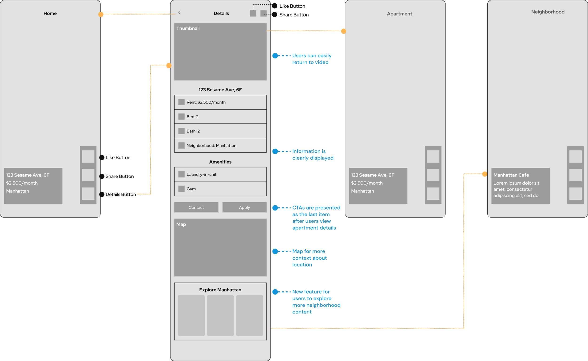
What did we improve?
In order to improve readability on our home screen, we added an opaque black card to both the text and button bar. We also removed the dislike, favorite, and offer buttons after taking into consideration our users’ minimal use of these buttons.
To improve our information hierarchy, we consolidated all logistical details of the apartment in one area, prioritizing the most impactful details such as price and number of bed/bath, followed by supplementary information like the apartment amenities.
New Feature
When we were discussing our users’ desire for more neighborhood information with our product manager, we realized that our product needed to include neighborhood content as another key feature. With neighborhood content, users are able to watch short-form videos of local businesses, like coffee shops and stores, and gain a comprehensive understanding of their potential next home. To accommodate this feature on our details page, we designed a card modal where users could scroll through a carousel of videos to select from or open a full-screen feed of those videos.
Final Home Tab Designs
When users enter our app, they land on the home tab where they can now clearly view text and key buttons. The apartment details page now has an effective information hierarchy that intuitively brings the user to neighborhood content after they have viewed all the information about the apartment and are looking for more information about the local area. Users are able to interact with neighborhood content by liking and sharing videos and viewing more details about the area.

Impact
20% increase in retention rates
After our launch, we found that there was a 20% increase in retention rates. We saw that users were engaging with the new version of our app a little over 2 times a month, which was about 2.2 sessions on average, whereas users only interacted with the old version of our app around 1.8 sessions on average.
What I learned
Implementation of an engineer hand-off system
From this project, I learned how to collaborate with engineers and I worked with them extensively to develop best practices for a streamlined and efficient design hand-off. Prior to this redesign, the engineers were exporting our Figma designs with little to no design specs or context which resulted in inaccurate shipped designs. We implemented a new handoff system where we clearly specified the core functions of each screen as well as the exact design specifications, resulting in a quicker hand-off process and accurate shipped designs.
* Image has been blurred for privacy reasons

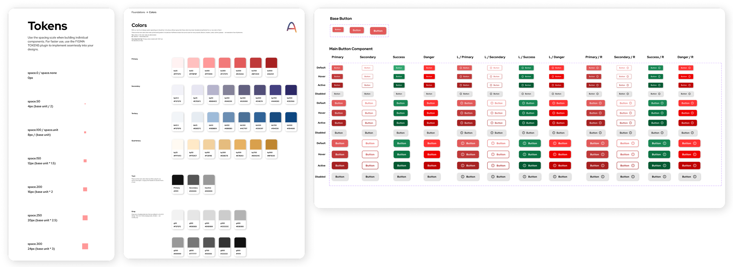
Building a design and component system
I learned the process of creating a design system with reusable components. Developing this system greatly improved April’s design and implementation process by standardizing components for both designers and engineers. We created master components of cards, buttons, and icons to build the foundation of our reusable components and implemented a standard spacing layout for our mobile designs. We also worked closely with the marketing team to develop a consistent brand identity by designing typography styles and color palettes.
Wearing a lot of different hats
I was a part of a small UX team which consisted of me and just one other person and because of this, I became very experienced and comfortable with the full research and design process. I took on various responsibilities and got the chance to have a major role in every part of the design process, such as user testing, wireframing, and prototyping just to name a few. Being a part of such a small team requires close collaboration and I learned how to effectively communicate with my team members to share ideas, provide constructive feedback, and coordinate our efforts productively. I enjoyed working with my teammates to collaborate on this project to create a product that was representative of our user’s needs and our business goals.